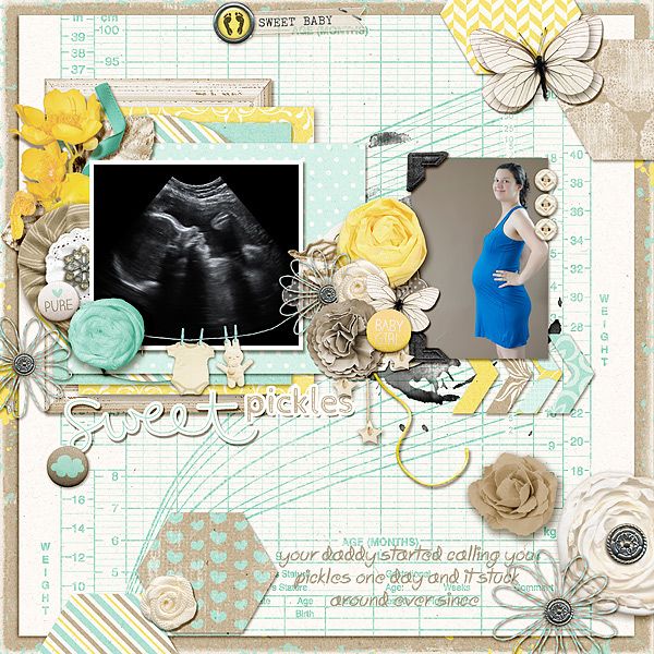
I made a layout a while ago that uses this technique several times.
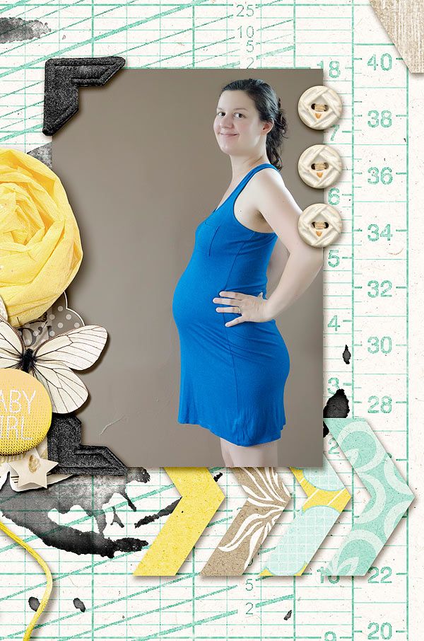
Do you see how the buttons are perfectly aligned and spaced out? Well there is a trick to make that happen in one click of the mouse each and once you know the trick you will never go back.
Also notice the chevron. Same trick was applied there.
Now it's time for you to try. Just follow along the instructions and you'll see how easy it is.
Create your page and add three elements of choice. They don't have to be the same exact buttons but it helps if they have approximately the same size and shape.
In my case I just duplicated the layer of my button twice and now I have three. Obviously they need some alignment and spacing check.
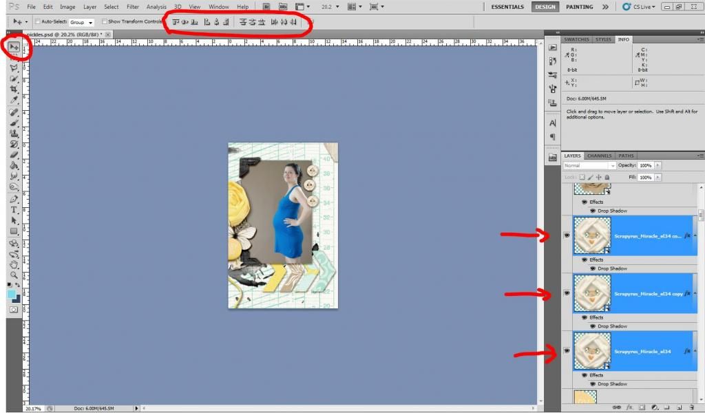
Now to use the trick in Photoshop you have to have the Move Tool selected (shift+v) and your three layers selected as well. To select all three layers at once click on the top layer, keep holding the shift key on your keyboard and click on the bottom layer.
Next we will take a look at the series of buttons I circled above in the middle of the toolbar.
If you hover your mouse over each button it will tell you what they do (align top edges, align vertical centers...). The left buttons are for alignment, the right buttons are for spacing. Now it will all depend on what directions you want your elements to be. In my case I need them aligned vertically from their center (although it wouldn't matter because they are round in shape).
So while my three layers are all selected I can now click on "align horizontal centers" (Notice how you think it should be "vertical" but it's the opposite.) and that takes care of alignment.
For the spacing I want them spaced out evenly from top to bottom so I will click on "distribute vertical centers". And voila!
If you need to move them around but don't want to disturb your hard work, move them as a group. You can select all three layers again and right click on one. Find "link layers". This will allow you to adjust their position on the page while keeping their distance with each other.
I hope you learned something today!
If you have enjoyed this tutorial, please feel free to link others here, but you are not allowed to copy its content or claim it as your own. You may download a PDF version of it HERE.
Curious as to what kit I used with this layout? You can find "Miracle Boy/Girl" at SBG and Sweet Bump also at SBG.


Awesome! Thank you! i was struggling with that this week.
ReplyDeleteYou're very welcome. I'm glad it was helpful to you.
DeleteThis comment has been removed by the author.
ReplyDeleteYour tutorial is very professional for graphic designer. It help me professional life. Thanks for sharing..........
ReplyDeleteclipping path service
background removing service
deep etching
Effective tips and tricks. Simply it's good for Photoshop lover. clipping path service
ReplyDelete