Our very first tutorial is about those all important shadows. Léa will guide you through the process of creating more realistic shadows in Photoshop. At the end of the post, you can find all the products used in the tutorial and a nice pdf version for you to download.
Let's get started ...
Have you ever wondered how to make your layouts look more realistic? One simple way to achieve that is by playing around with your shadows.
If you were to place a freshly cut flower on a piece of paper, you would see that its shadow is never quite regular, especially if the flower has many layers of petals. If you just add a drop shadow with Photoshop it will look flat and unrealistic. Same goes for all your other elements, ribbons, even papers... A little bit of tweaking goes a long way.
Let me show you an example of before and after and then we can do a step by step so you can try this yourself. Once you know this trick, you'll want to rework shadows on almost everything on your page!
See how different it looks?
So here we go for some step by step instructions:
-
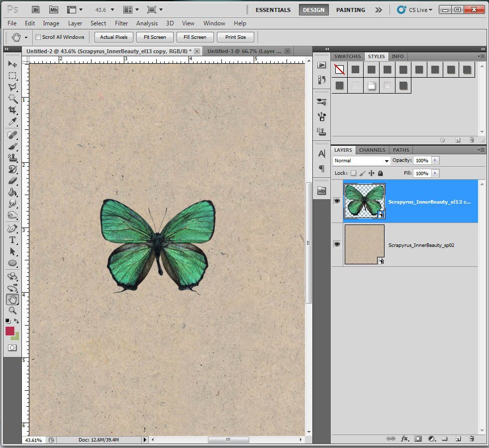
Open your .psd file with all your layers, or if you just want to try it out, open a new 12x12 document, add a paper and add an element of your choice on top of the paper.
-
Add a shadow to your element by selecting the element's layer and right clicking on it. A drop down menu will appear. Select “Blending Options”. A new window will appear.
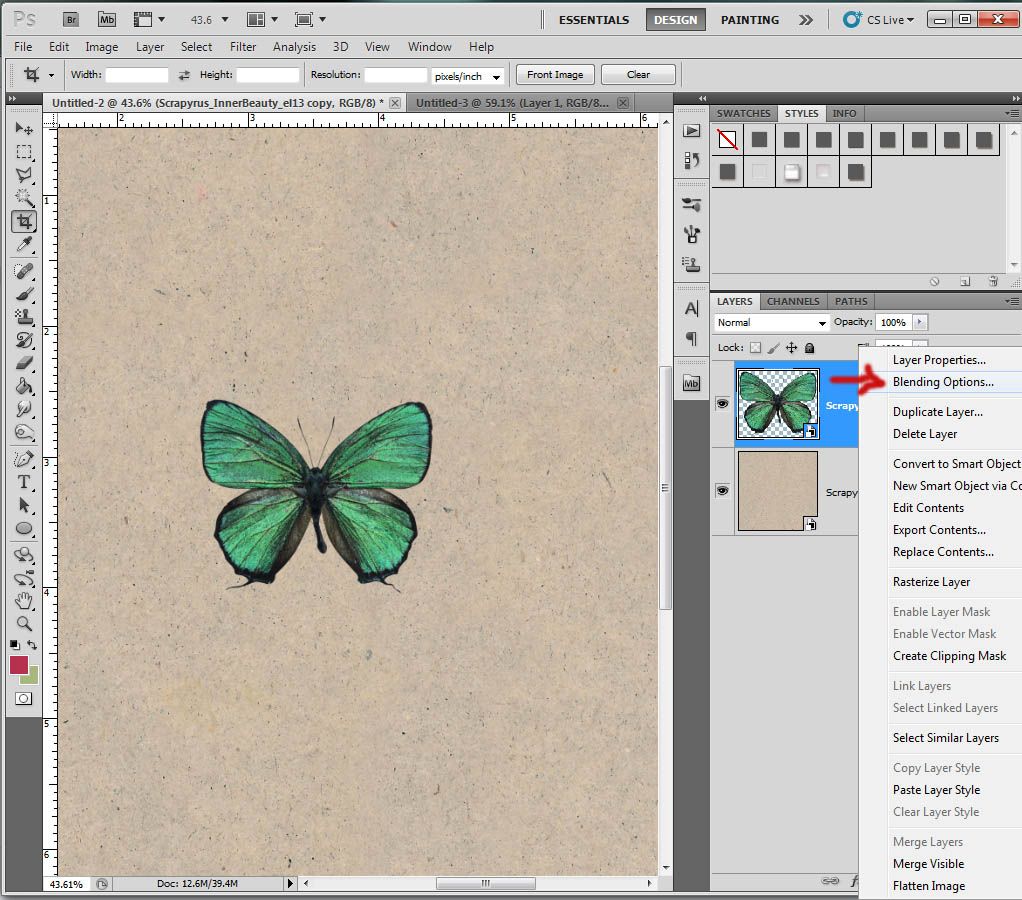
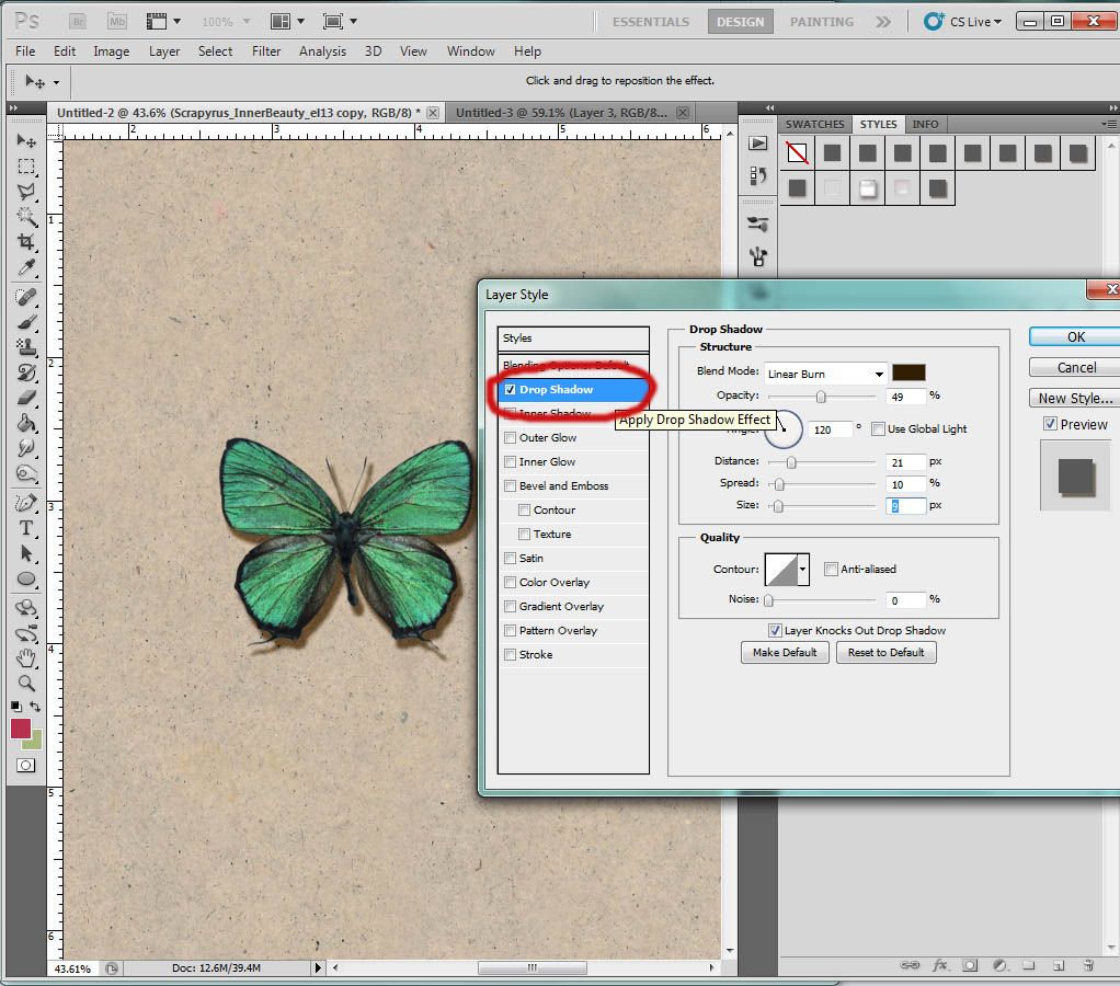
Click on “Drop Shadow” on the left hand side and make sure it's ticked. If you click on “drop shadow” it should be highlighted and you will be able to adjust your shadow's settings. You can now adjust it to your liking. These are the settings I usually use:
- It is important that you select the layer where your shadowed element is for the next step.
If you can't see the detail of your added styles underneath your element, click on the little arrow on the right side of the layer and it will reveal the layer effects. You should be able to read "effects” and “drop shadow".
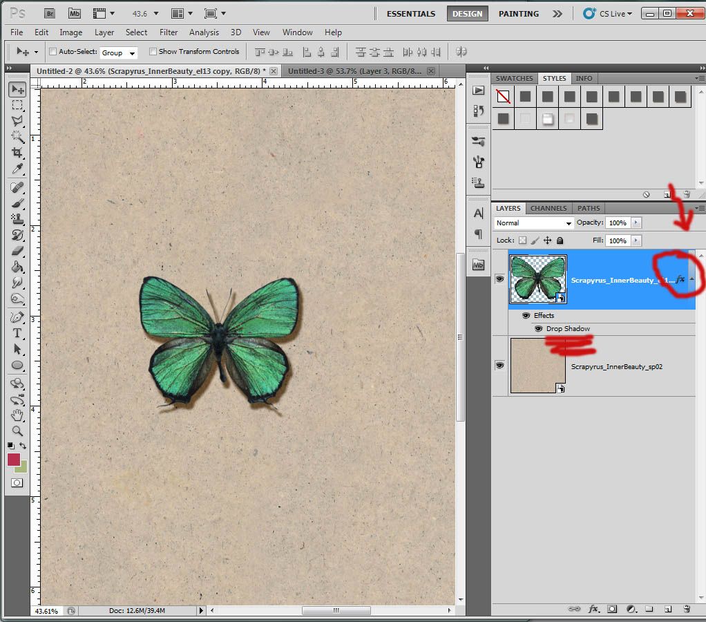
- Right click on "drop shadow" and a drop down menu will pop up. Select "create layer" and the shadow will become its own layer. I would advise to save your work at this point just in case you don't like what you've done.
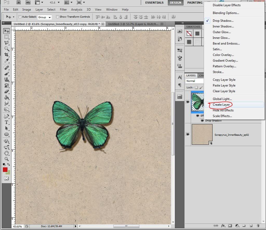

Please note that at this point you cannot change the style of the shadow layer anymore. You would need to start over if you wanted to make a more defined shadow etc...
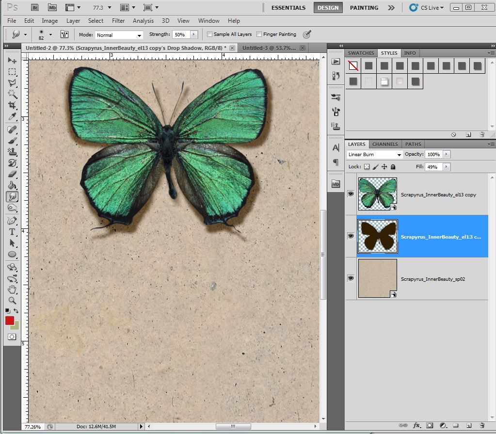
- With the drop shadow layer selected, find the smudge tool. Its icon looks like an index finger pointing down. If you don't see it, it may be hiding behind a tear drop or a triangle.
Click on either icon and a menu will appear. You will find the smudge tool there.
The smudge tool allows you to push and pull the shadow around. With the shadow on its own layer you can now adjust it without having to modify the flower/element itself.
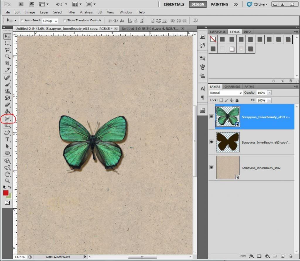
- I selected a soft brush with a size of 39. This will depend on the size of your element on the page. Start pulling and pushing your shadow around until it's pleasant to your eye. There is no correct way to do this. You just have to do it by trial and error. Make sure to have the shadow layer selected or you will distort your element. If you're unhappy undo (Ctrl-z) is only a click away.
In this example I want the body of the butterfly to touch my page while its wings are floating.
I started at the base of the butterfly's body and pushed the shadow up towards the top layer so it would be almost invisible. That way it looks like the body is closer to the page. I did the same method for the antennas, making them touch at the base. For the wings I chose a bigger size brush (82) as the area to push around was much larger. If you were to choose a smaller brush the shape would become uneven really quickly.
I made the parts of the wings close to the body smaller and increased the size as I got further from the body. Keep playing until you like what you see.
Another trick that works best for foliage is to select the shadow layer and rotate it a little bit to create depth. I use Ctrl+t then use one of the corners to drag the layer to the left or right. Once you like it, click accept. You can then reposition the layer if it needs adjustment by either clicking on it with your mouse and dragging it across your page or use the left, right, up or down arrows on your keyboard. You can also add some smudging to this step.
If something doesn't look good, use the Ctrl+z to delete the last actions performed.
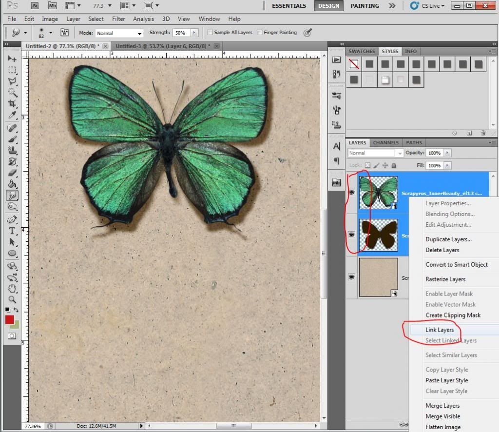
- Once you are satisfied with the shadow, select both the shadow layer and the flower/element layer at the same time by clicking on one layer, pressing the ctrl key, and clicking on the
other layer. Right click from one of the layers and select "link layers" from the drop down menu. A chain link will appear next to both layers. This will make sure that both layers stay together if you re-position them on the page.
I use a linear burn for blending mode and change the basic black color to a brown or maroon. My opacity is usually around 50%.
My angle is usually at 120 degrees and I untick global light.
Now for the distance, spread and size, it will depend on what is pleasing to the eye.
For this example I used 21 for my distance, 10 for my spread and 9 for my size.
You can also just use the preset shadows that come with Photoshop. Find one that you like overall. For flowers I usually pick a larger distance with softer edges. For foliage, I use a larger distance with defined edges. And I usually work my way up from papers to elements. A smaller distance for papers and increase the depth of the shadow as you move up along the layers.
Here are a few other examples using the same trick:

Am I over-using it?? Like I said, it doesn't have to be just for elements. Even paper sometimes needs a little boost. Same goes for stickers, tags, ribbons... So go on and try this trick and I'm sure you will love it too.
You can download a pdf version of this tutorial here. We hope you enjoy it!
Products used in this tutorial:
If you have enjoyed this tutorial, please feel free to share it, but you are not allowed to copy its content or to claim it as your own.
It’s even better to share the link to this blog as we will be adding new tutorials regularly on scrapyrusdesigns.blogspot.com


Thank you for this! I loved it!
ReplyDeleteWow... thanks for the PDF too! C'est très gentil!
ReplyDeleteGreat tutorial AND it is nice that you have it in PDF format as well, thank you.
ReplyDeleteThank you for this very detailed tut - but thank you even more that you provided us with a PDF. This is so helpful. :)
ReplyDeleteThanks so much for the detailed tutorial - I can't wait to give it a try.
ReplyDelete